This table documents the progress I have made and gives a quick overview of everything
| Date | Project Title | Summary | Authors |
|---|---|---|---|
| 03-12-2021 | 17vs78 | 17vs78 is a challenge for us to represent 17 and 78 in creative ways. Techniques were encouraged to be creative and varied from pie charts to washers. | Dakota Chang, Hadrian Reppas, Darian Zhang, Nathan Xiong |
| 04-12-2021 | Representing part-to-whole is the first task of a challenge. Challenges taken from the 30-day Chart Challenge. | Dakota Chang | |
| 06-12-2021 | These are some notes about the paper Considering Visual Variables as a Basis for Information Visualisation. | Dakota Chang | |
| 07-12-2021 | Utilising pictograms is the second task of a challenge. Challenges taken from the 30-day Chart Challenge. | Dakota Chang | |
| 08-12-2021 | In this project, we explored and created a physical visualization of one part of the Addison Gallery datasets that fascinates us. | Dakota Chang, Sofia Marina | |
| 09-12-2021 | Utilising pictograms is the second task of a challenge. Challenges taken from the 30-day Chart Challenge. | Dakota Chang | |
| 12-12-2021 | Creating historical graphs is the third task of a challenge. Challenges taken from the 30-day Chart Challenge. | Dakota Chang | |
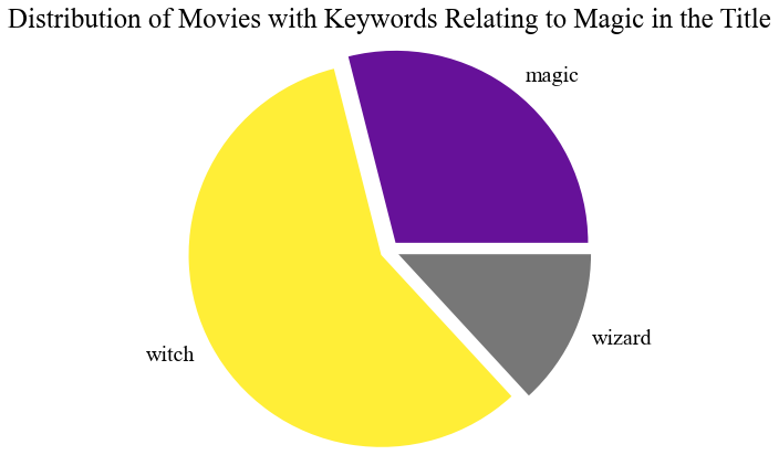
| 16-12-2021 | Creating magical graphs is the fourth task of a challenge. Challenges taken from the 30-day Chart Challenge. | Dakota Chang | |
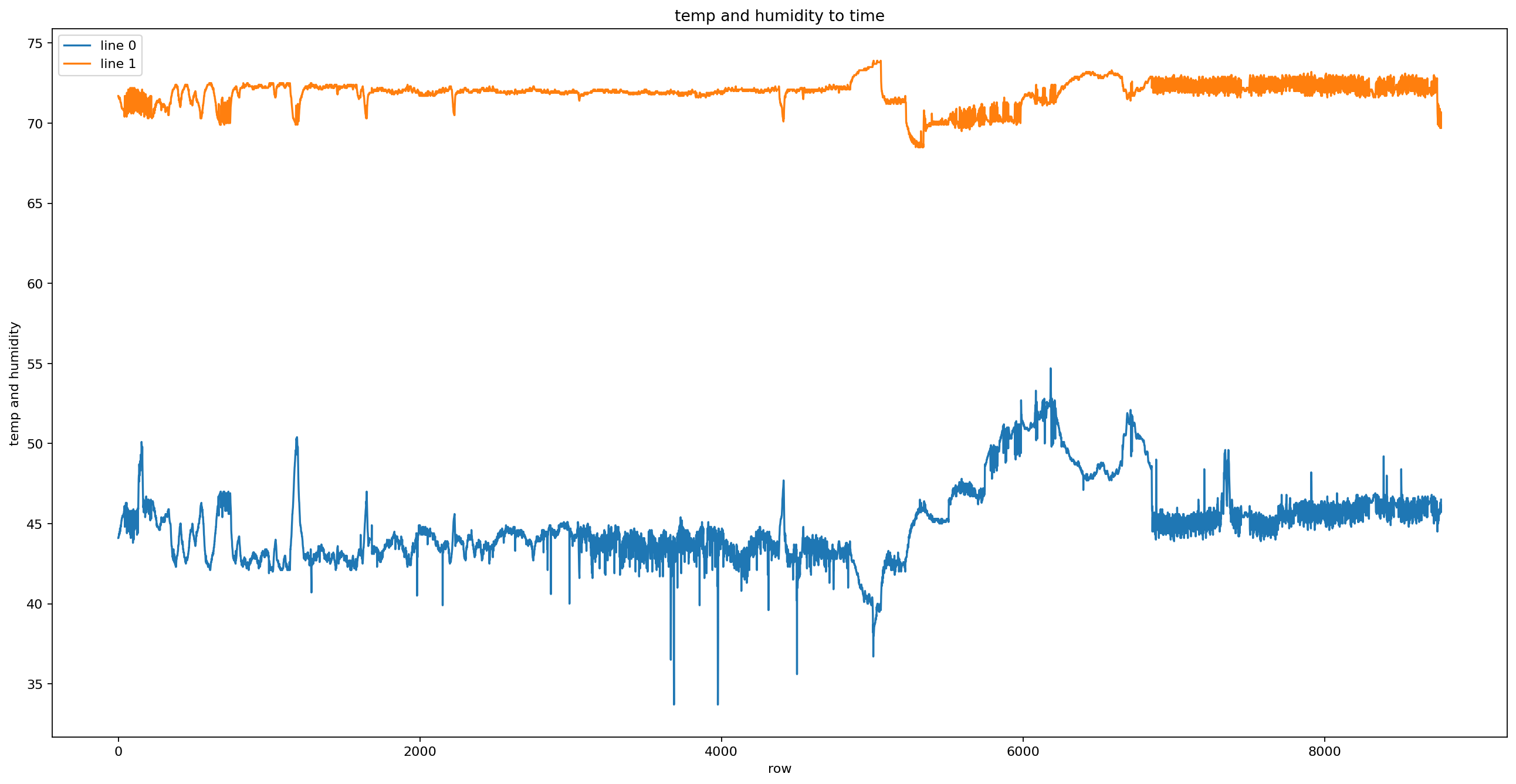
| 09-01-2022 | Creating line graphs is the fifth task of a challenge. Challenges taken from the 30-day Chart Challenge. | Dakota Chang | |
| 18-01-2022 | Creating physical distrubution graphs for is the seventh task of a challenge. Challenges taken from the 30-day Chart Challenge. | Dakota Chang | |
| 20-01-2022 | Creating animal distrubution graphs for is the eighth task of a challenge. Challenges taken from the 30-day Chart Challenge. | Dakota Chang | |
| 21-01-2022 | Creating statistical distrubution graphs for is the ninth task of a challenge. Challenges taken from the 30-day Chart Challenge. | Dakota Chang | |
| 22-01-2022 | Creating abstract distrubution graphs for is the ninth task of a challenge. Challenges taken from the 30-day Chart Challenge. | Dakota Chang | |
| 23-01-2022 | Creating statistical distrubution graphs for is the eleventh task of a challenge. Challenges taken from the 30-day Chart Challenge. | Dakota Chang | |
| 27-01-2022 | Creating distrubution strip graphs for is the twelve task of a challenge. Challenges taken from the 30-day Chart Challenge. | Dakota Chang | |
| 28-01-2022 | Creating a network chart is a part of an assignment. Here I used a marvel heros and comics dataset to display the pros and cons of network charts. | Dakota Chang | |
| 01-02-2022 | Creating relationship correlation graphs for is the thirteenth task of a challenge. Challenges taken from the 30-day Chart Challenge. | Dakota Chang |
This chart is made by Dakota with Google Sheets, source of statistics is ESPN.
When it comes to part-to-whole comparisons, people often think of pie charts or donut charts. However, while watching this football match, I realised sports statistics often use 100% stacked bar charts, which is a form of part-to-whole comparison charts, so I decided to make one and demonstrate a real-life usage of these charts.
These notes are made by Dakota and hosted through Google Drive.
Here are some quick notes I took while reading the paper. I thought the paper was very informative and fun to read, partially thanks to the great examples and graphs/tables that demonstrate its main points.

Made with PyWaffle (code), source from Addison Gallery of American Art.
description to be uploaded

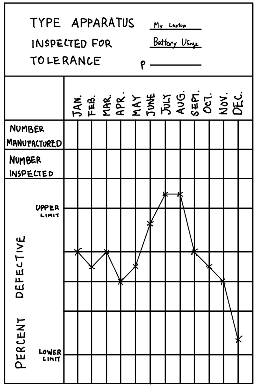
Hand Drawn with Notability. Source for reference.
I have always been a huge fan of quality control, and in this challenge, I recreated the first control chart to ever be made. The original version was created by Walter Andrew Shewhart, an American physicist, engineer and statistician, sometimes known as the father of statistical quality control and also related to the Shewhart cycle. His work is inspired by William Edwards Deming.

Made using matplotlib (code) for reference.
I used a movie dataset and checked out how many movies there are that relates to magic.

Made using wordcloud. (Code) linked for reference.
This is a continuation of the line graph project. These are the most commonly seen words in their recent videos. More information to be found in the code.
Made using Flourish.
I decided to make a chart using Flourish and elected to use the data from the summer Olympics game of the Women's 100m freestyle. The race was chosen due to its cultural significance in Hong Kong.
Made using Flourish.
I used Flourish again and created a video chart with soccer statistics.
Made using Altair. (Code) linked for reference.
I made up hours spent on each classs I am taking this term and created a donut chart with Altair.
Made using Altair. (Code) linked for reference.
I made up hours spent on each classs I am taking this term and created a donut chart with Altair.
Made using GraphViz. (Data cleaning code) linked for reference.
I used a dataset from kaggle and the SketchViz library to create a network graph of the most commonly appearing heros and some classic comic issues they starred in.

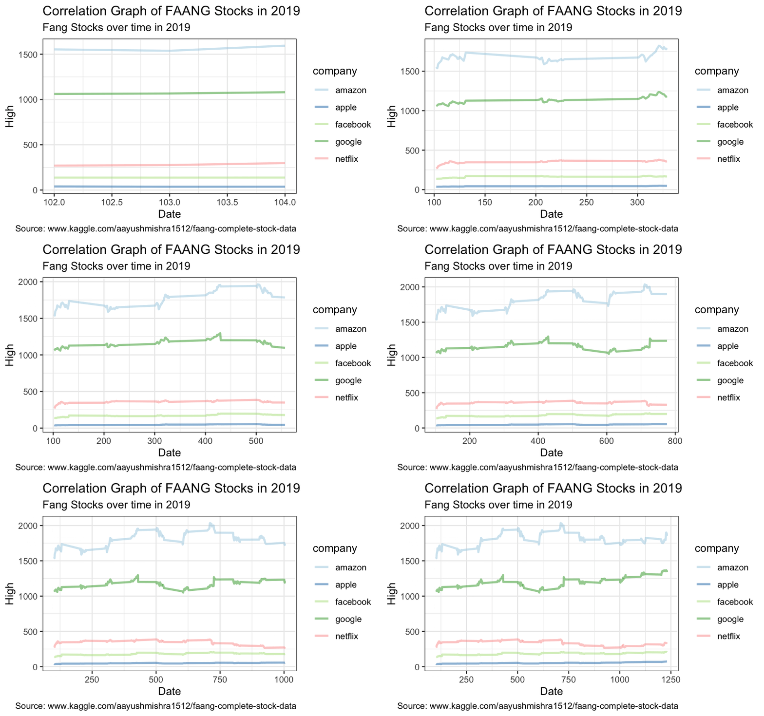
Made using ggplot2. Code for graph and data cleaning code and linked for reference.
I got stock prices data of FAANG company in 2019 from a dataset from Kaggle and graphed an animated plot using R and ggplot2 to see the correlation between stock prices of the biggest tech companies.